


Knowledgebase articles
- Welcome to the Knowledge Base
- Introduction
- Training
- Getting Started
- Preferences
- Activities
- Cases
- Importing Data
- Leads
- Marketing
- Introduction to Marketing
- Marketing Campaigns
- Mailing Lists
- Products
- Mailshots
- Upload Library
- Templates
- Event Management
- Compliance Records
- Force24
- Spotler Integration
- What is Spotler?
- Navigating your Spotler homepage
- GatorMail
- GatorLeads / Web Insights
- Tracking Code
- Setting up the Plugin
- Viewing Web Insights Data on your Form Layouts
- Domain Names and Online Activities
- Reporting incorrect Leads created through Web Insights
- Reporting on Web Insights data
- Using UTM Values
- Why aren’t Online Activities being created in the database?
- Why is GatorLeads recording online activities in a foreign language?
- GatorSurvey
- GatorWorkflow
- GatorPopup
- Opportunities
- Projects
- Integrations
- Mapping
- Electronic Signing Tools
- Creditsafe Integration
- Zapier
- Introduction to Zapier
- Available Triggers and Actions
- Linking your Workbooks Account to Zapier
- Setting up Zaps
- Posted Invoices to Xero Invoices
- Xero payments to Workbooks Tasks
- New Case to Google Drive folder
- New Case to Basecamp Project
- New Workbooks Case to JIRA Ticket
- Jira Issue to new Case
- 123FormBuilder Form Entry to Case
- Eventbrite Attendee to Sales Lead and Task
- Facebook Ad Leads to Sales Leads
- Wufoo Form Entry to Sales Lead
- Posted Credit Note to Task
- QuickBooks Online
- Survey Monkey responses to Tasks
- Multistep Zaps
- Email Integrations
- Event & Webinar Integration Tools
- GoToWebinar
- ON24
- Microsoft Office
- Outreach
- Installation
- Outreach Authentication
- Sync People to Outreach Prospects
- Sync Organisations to Outreach Accounts
- Sync Workbooks Opportunities to Outreach
- Sync Tasks/Activities from Workbooks to Outreach
- Sync Outreach Sequences to Workbooks
- Sync Outreach Sequence States to Workbooks
- Sync Outreach Sequence Step Numbers to Workbooks
- Sync Prospects/Accounts/Opportunities from Outreach to Workbooks
- Sync Outreach Tasks/Calls/Meetings to Workbooks
- Scribe/Workbooks Connector
- RingCentral
- Auditing
- Comments
- People & Organisations
- Reporting
- Introduction to Reporting
- Using Reports
- Introduction to Charts
- Exporting Reports
- Advanced Reporting
- Report Snapshots
- Dashboards
- Transaction Documents
- Introduction to Transaction Documents
- Displaying & Adding Transaction Documents
- Copying Transaction Documents
- Transaction Documents Fields Help
- Transaction Documents Line Items Help
- Printing & Sending Transaction Documents
- Managing Transaction Document Currencies
- Managing Transaction Document Statuses
- Setting a Blank Default Currency on Transaction Documents
- Credit Notes
- Customer Orders
- Invoices
- Quotations
- Supplier Orders
- Contract Management
- Sagelink
- Introduction to Transaction Documents
- Configuration
- Introduction to System Administration
- Users & Security
- Database
- Accounting
- Email Integrations
- Customisation
- Creating & Modifying Picklists
- Theme
- Record Types
- Creating Custom Fields
- Report-based Custom Fields
- Linked Fields & Reference Fields
- Record Templates
- Form Layouts
- Customising relationships between parties
- Opportunity Stages
- Custom Records
- Sign In Customisation
- Automation
- Contact Support
- Releases & Roadmap
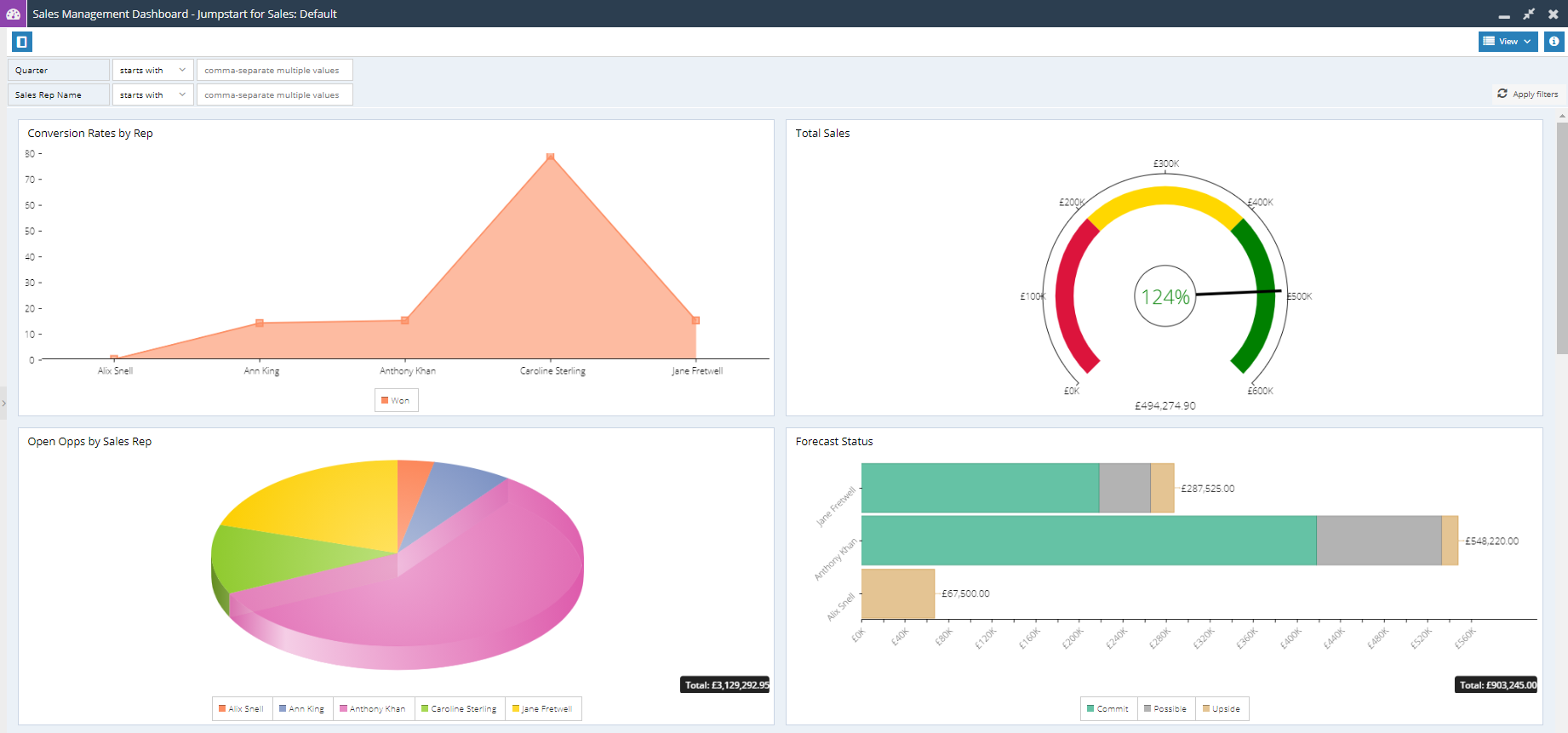
Introduction to Charts
Workbooks includes the ability to create Charts from a Report so that reports can be easily displayed visually as well as in a grid format. Charts can then be added to Dashboards, or sent out through Scheduled Emails.
Workbooks includes a number of different Chart types:
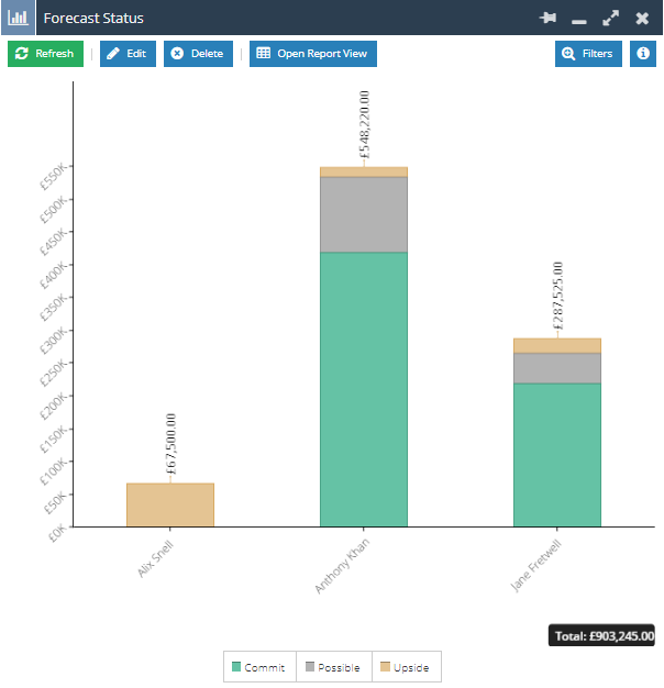
Bar Charts – Bar Charts are ideal for tracking performance of a Team or individual performance. Bar Charts can also include targets, allowing you to see the performance against target visually.
Line Charts – Line Charts allow you to better track trends over time; these work well for reports that use a Split column, as multiple lines can be represented on a single chart for easy comparison.
Pie Charts – Pie Charts allow you to see data as proportions of a total, such as when comparing the different sources that Cases or Leads were created through, and are useful to understand where resources may need to be allocated.
Dial Charts – Dial Charts let you see where you are against an overall target; these can be generated from a Summary View, such as the total value of won Opportunities against an annual Target.
NOTE: Following the guide on another Knowledge Base article here will show how to add charts and elements to Dashboards.