


Bar Charts
Introduction to Bar Charts, how they can be used and an overview for all of the configuration options available.
Bar Charts are a good method of presenting your categorical data in Workbooks Reports. A Bar Chart uses proportional rectangles to illustrate the values in the underlying data set which they represent. Bar Charts excel at showing the relative size of your data points, allowing you to quickly see the biggest and smallest values at a glance.
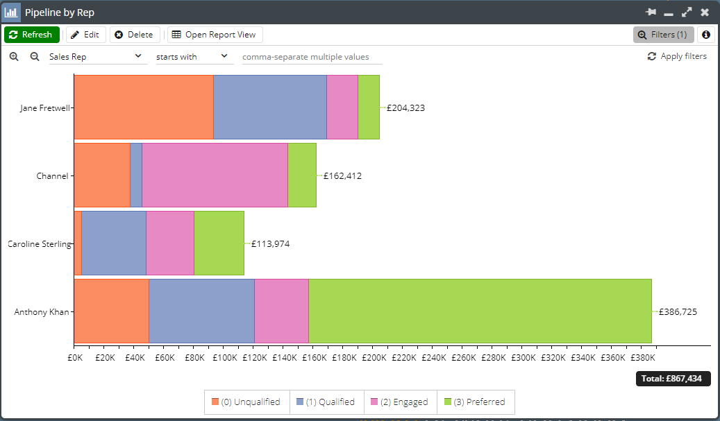
Bar Charts can be generated for reports that can be broken down into segments easily, such as the Template Report, Template – Sales – Total Performance, which shows the total value of won Opportunities.
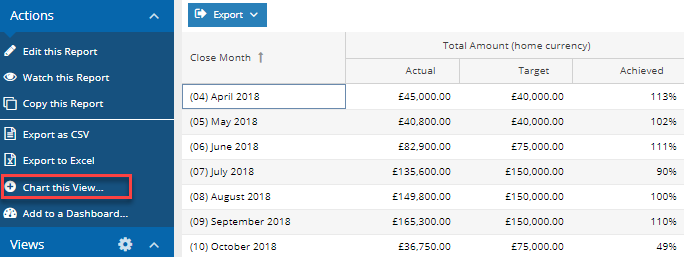
Create and run your report then you’ll see the option to Chart this View; selecting this will generate a new window.
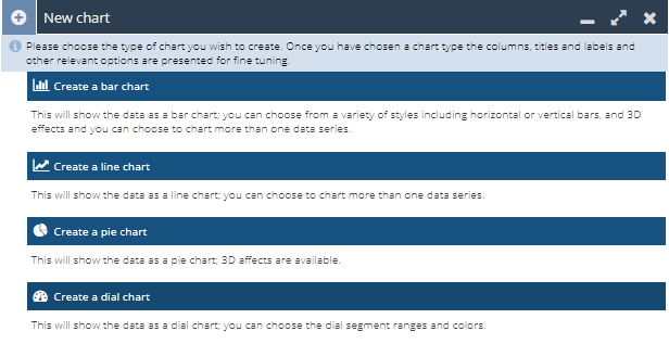
Select Create a bar chart.
Data series
Column – Select which column(s) on your report will be represented in the chart. You can only select columns from the report that contain numeric results. This field is multiselect, allowing you to see multiple columns from the report in a single chart.
Targets
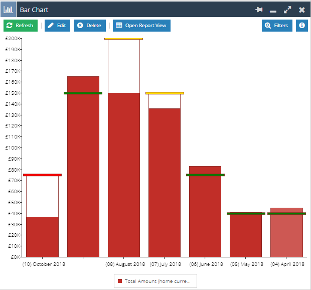
Show Targets – If you’ve included Targets in your report, these can be represented on the Bar Chart. These can also be configured with styling to change the appearance depending on performance against target. More information on configuring the targets can be found on the Targets on Bar Charts page.
Axis Name – By default, the chart will use the column label as the name for the axis, however this can be overwritten with a different value by updating this field.
Scale – By default, the numbers shown on the axis will start at zero and extend to the highest number in your report. The highest number will change in line with the data in your report. If you want to specify a fixed scale, tick the checkbox next to Define a fixed scale and enter your minimum and maximum values. This can be particularly useful if you plan to show two charts next to one another on a Dashboard.
Advanced
Bar orientation – By default this will be set to vertical bars, but can be changed to appear as horizontal bars.
Show values on bar – Values can be hidden completely or shown inside/outside the bar in a number of ways.
Show values on mouseover – If you’ve hidden the values from the bar, you might want to check this box to display the value from the report column when you mouseover a specific bar.
Show grand total – Creates a box that displays the total of all the bars within the chart, which is positioned under the horizontal axis. The Grand Total displays the total of what is on the chart, so if filters are applied through the legend the Grand Total will change accordingly.
3D – Displays the bar chart in three dimensions
Stacked (when >1 data series) – If you have more than one column selected in the report you can choose whether to display the different columns side by side or stacked on top of each other.
Show actual and visible values – If you have the Grand Total shown on the chart and want to display what the overall total is at all times regardless of the filters applied, then this setting needs to be enabled.
Axis label orientation – Choose how you’d like the axis labels to appear.
Category
Label Column – Select the report column to use as the horizontal axis of the chart. Normally this will be the Grouping Column used within the Report View.
Axis Name – By default the chart will use the column label as the name for the axis, however this can be overwritten with a different value by updating this field.
Advanced
Axis label orientation – Choose how you’d like the axis labels to appear.
Sort labels by – This will change the order that the bars appear in the chart, by default this will use the order set in the report.
Sort labels direction – If you have changed the ‘Sort Labels by’ setting, the direction of sort can be changed between ascending and descending.
Legend
Show legend – Ticking this checkbox displays the legend on the chart, defining which colour is used for each column. When the Chart has been generated, you can click on options in the legend to toggle bars off/on for a more detailed comparison of the visible bars.
Position – Use this dropdown to control the position of the legend.
Layout – The legend can be wrapped so that all of the values appear in the chart window, however this may mean that values appear over multiple lines, reducing the size of the chart. Alternatively, they can be set to a single row and you will have the ability to scroll off screen to find the required value.
Styling
Palette – This controls the colour palette used for the bars.
Reverse the palette – Bars will be coloured in the order of the palette; if you do not want to use the first colour you can reverse the palette and use the final colour instead.
Vertical lines – Apply grid lines along the vertical axis; these can be used to better mark values on the chart for easy analysis.
Vertical axis marks – Choose whether you would like the vertical axis marked at intervals to make it easier to read the values of the data.
Vertical axis labels – It is possible to remove the value labels from the vertical axis; this setting may be used if you are interested in overall trends rather than the actual numeric values.
Horizontal lines – Apply grid lines along the horizontal axis, these can be used to better mark values on the chart for easy analysis.
Horizontal axis marks – Choose whether you would like the horizontal axis marked at intervals to make it easier to read the values of the data.
Horizontal axis labels – It is possible to remove the value labels from the horizontal axis; this setting may be used if you are interested in overall trends rather than the actual numeric values.