


Creating a Sales Dashboard
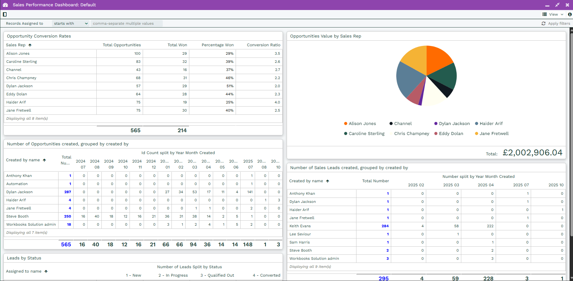
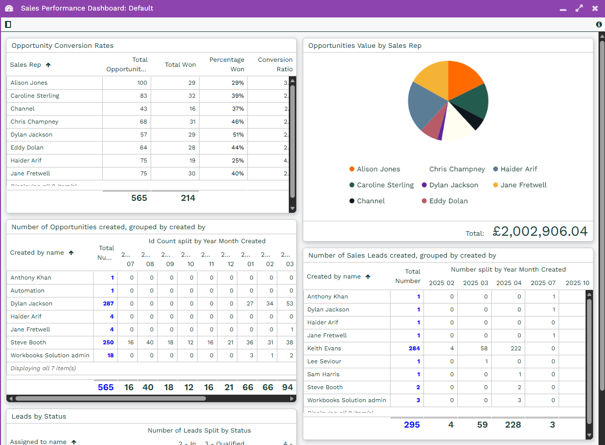
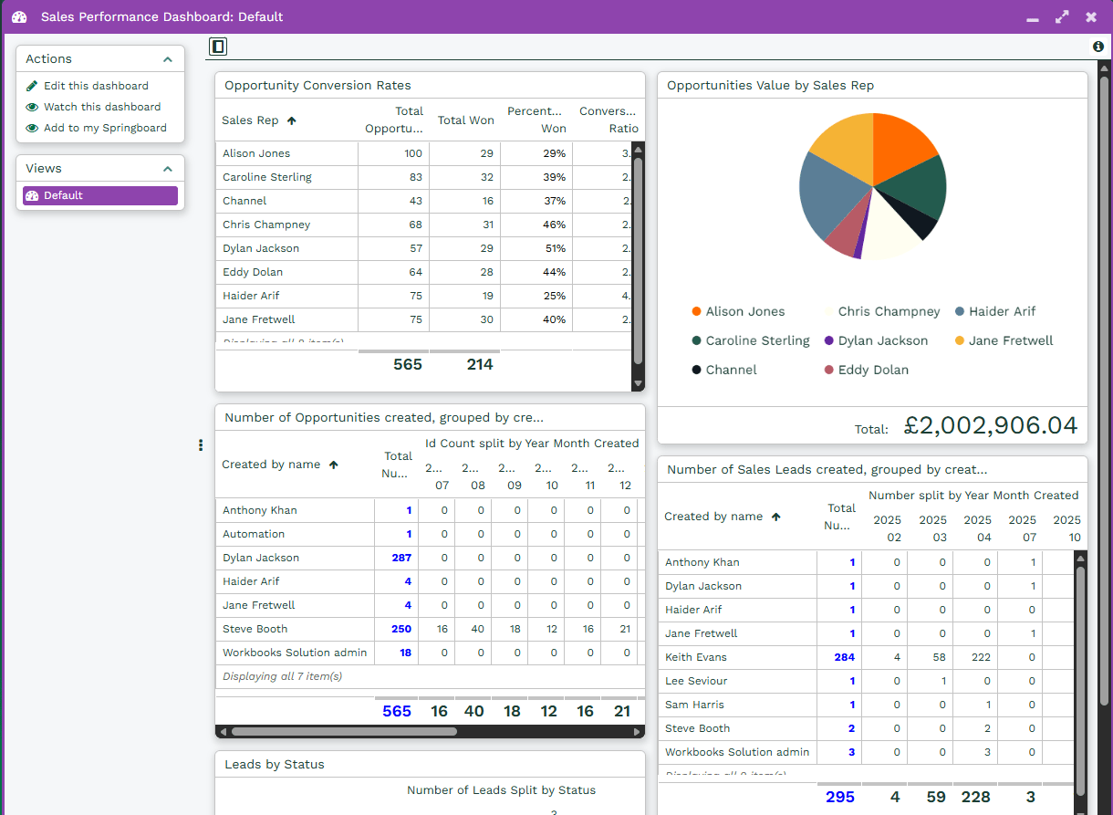
In this example we will build a Dashboard that gives you an overview of the performance of your Sales Team. The end result will look like this:
Stage 1: Create Reports
In order to populate the Dashboard you will first need to create the Reports and Charts needed to display the data.
Step 1: Create Template Reports
In this example we are creating a Dashboard using five Template Reports. These can all be accessed from Start > New > Report > Create a Report from a template report and then select the name from the list below:
- Template – Leads Assigned to Sales Reps by Status
- Template – Sales Leads – numbers
- Template – Current Sales Pipeline by Stage
- Template- Opportunities – numbers
- Template – Opportunity Conversion Rates
Once these Reports have been created they are ready to be added to the Dashboard, but at this stage you may want to take the opportunity to add any additional fields you want to see, and review the criteria to ensure they work with your data.
Step 2: Create a chart
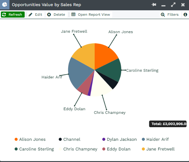
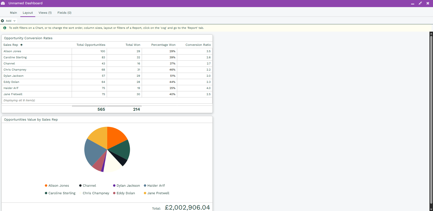
For this Dashboard we will create a Pie Chart for the Report Template – Current Sales Pipeline by Stage. To do this you will need to Run the Report and then select the Action Chart this view. We will then use the Total Amount as the Data Series and the Sales Rep as the Category.
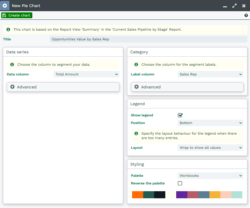
Save & Close this, a Pie Chart similar to below should be generated:
Stage 2: Create the Dashboard
You can now create the Dashboard and setup the Elements needed
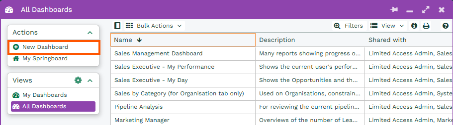
Step 1: Create a new dashboard
To create the Dashboard go to Start > Dashboards and then select New Dashboard.
The Dashboard will need a Name and here you can select the number of columns you want. In this example, we’re calling it “Sales Performance Dashboard” and setting two Columns with a 50/50 split.

Click Save and navigate to the Layout Tab. Here you will be able to add the Reports and Charts created in Stage 1.
Step 2: Add the Reports
To add the Reports select Add Picklist and then Report.
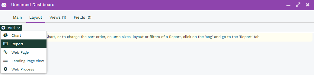
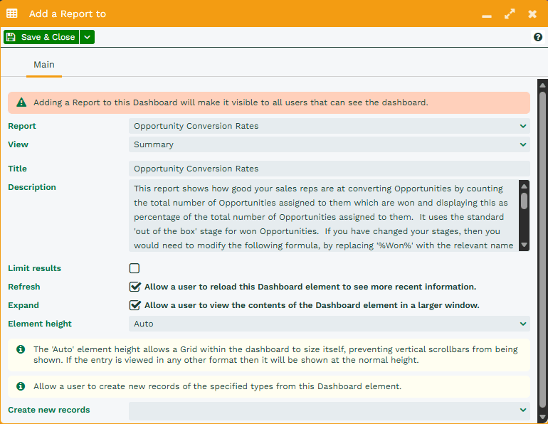
Each Report will need to be added individually, using the Report Column select the Report by name and then the View you would like to add. By default, the Title will be set the View name, but you can change this if needed.
Any additional settings can be edited at this stage on the Report, in this example we will use the default settings, but more details on this can be found on our Knowledge Base.
Step 3: Add a chart
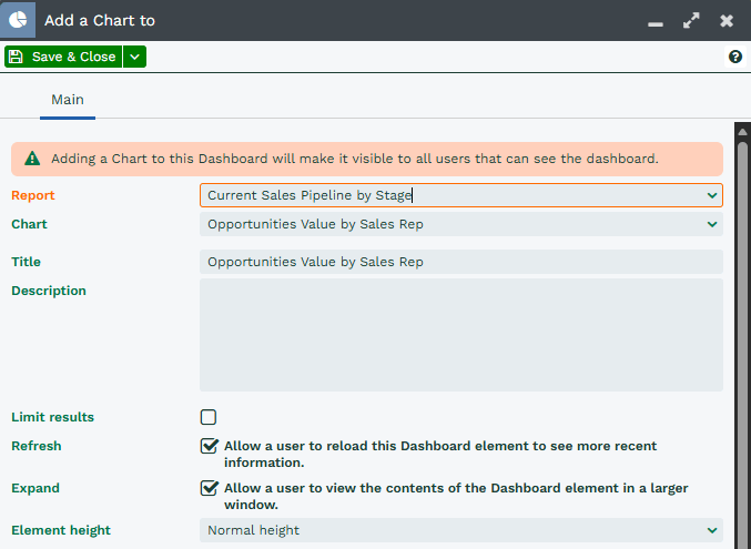
Once the Reports have been added, the Charted view can be added in exactly the same way, by Selecting Add and then Chart.
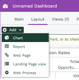
This time, only Reports with a Charted View will appear in the Report Field, which should make it easier to find the required Report. Similarly to a Report element addition settings can be configured for the Element, but we will use the default for this example.
Step 4: Modify the element positions
Once you have added the Report and Chart Views to the Dashboard all of the Views will appear in the left hand column with the most recently created will appear at the top.
By selecting the Element Header you can then drag and drop each element into either Column and into the order you want.
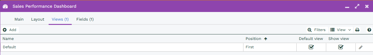
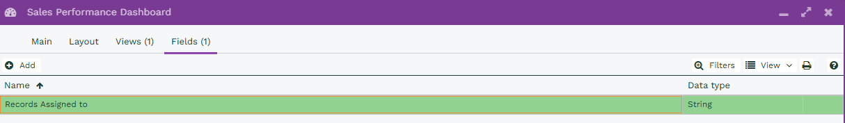
Stage 3: Create a Dashboard Field
We will now create a Dashboard Field which will be used to map the Sales Rep name from each of the Reports and Charts. This allows you to see not only overall Team Performance but also the performance of an individual.
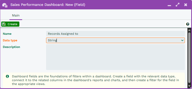
Step 1: Create the field
Within the Dashboard select the Fields tab, from here you will create the Dashboard Field.

This Dashboard Field will be called “Record Assigned to” and will be using a Data type of String (because the Assigned to will always be in text form).
Step 2: Add field mappings
A field mapping will now need to be added between the Dashboard Field and each element within the Dashboard, this will then allow you to filter each element as required.
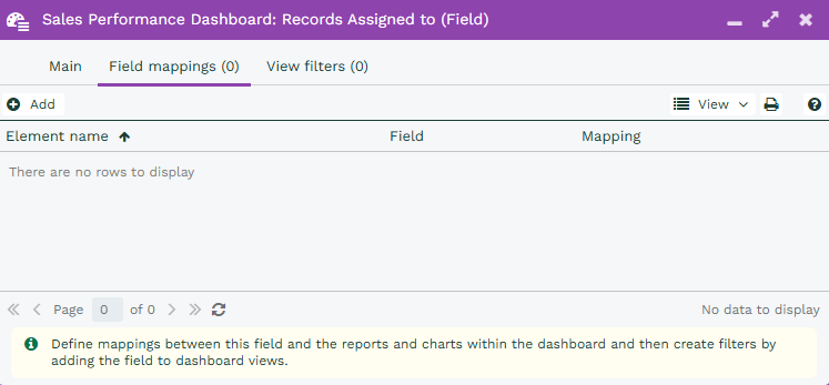
By selecting the Add button you can then select the Element, Report View or Chart View and then the column from each element that you want to map to, this may be called Assigned to, or Sales Rep within the Report.

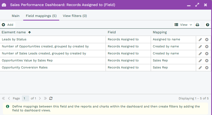
This will need to be carried out for each Element within the Dashboard that you want to add the mapping to. Within the example below you should end up with a list of field mappings similar to the below.
Step 3: Apply to a View
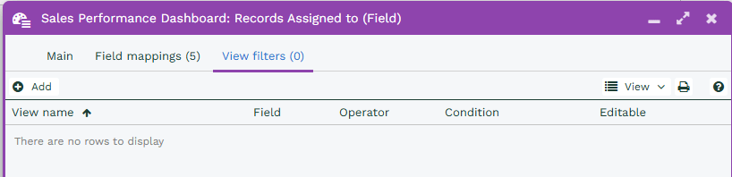
Once the Field Mappings have been set up we can apply filters to a Dashboard View. To do this go to the View filters tab and select Add.
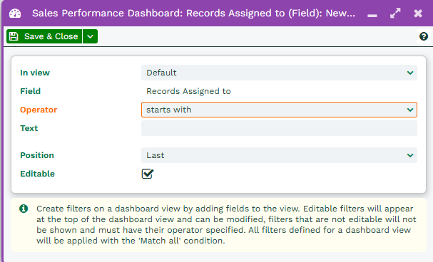
At the moment there is only one Dashboard View, Default. We will create a filter in the Default view that will allow us to perform a starts with search on the Record Assigned to Dashboard Field that has been created.
This means that we need to select these values for the View and Field options when configuring the Filter. For the Operator select starts with and leave the Text field blank. Ensuring that the Editable box is checked allows us to use this Filter like a Landing Page Filter.
Saving and running the Dashboard, you will now see that there is a Filter at above the the Elements where you can apply a value to the Record Assigned to and filter the Reports and Charts accordingly.
Stage 4: Create a User specific View
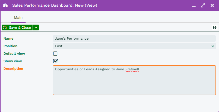
We will now create a View to look at a specific User’s performance across these Reports, we will then add an additional View filter to the Dashboard Field so that when the view is selected you will only see the specified User’s activity.
In this example we will be looking specifically at where the Record assigned to value is Jane Fretwell.
Step 1: Create a new view
Within the Dashboard Edit Menu navigate to the Views tab and select Add as we want to keep our Default View.
We will call this View “Jane’s Performance” and provide a Description to match this. Once this is done Save & Close this View.
Step 2: Create a new field mapping
From within the Edit Dashboard menu, go back to the Fields Tab and open the existing Record Assigned to Field. We do not need to create a new Field but can edit the existing one to display different results for different views.
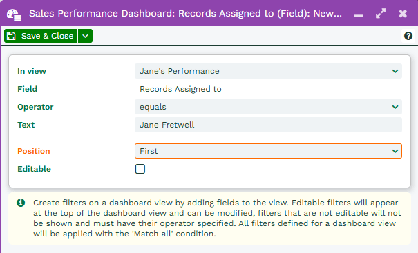
Once you have opened the Dashboard Field select the View filters tab and select Add.
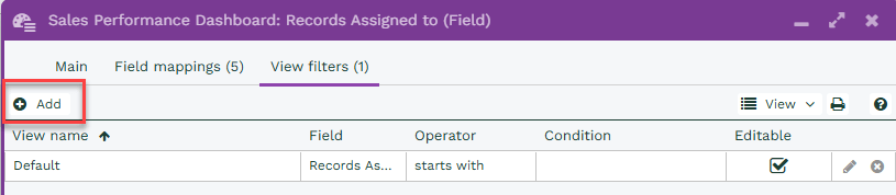
When setting up this Filter, we are going to select “Jane’s Performance” for the in view value, we then apply the operator of is and enter Jane’s full name. In this scenario we will also remove the editable setting from the filter so it will only ever output Jane’s details.
Saving and running the Dashboard now you will notice a new View has been created and is accessible on in the Views section of the menu similar to a Landing Page. As we made the Filter read only there is no visible filter available on the Dashboard as there was with the Default view. The filter has been applied and hidden from a User’s view.
