Card View
View Landing Pages and Reports as Cards
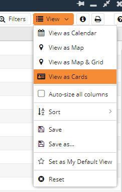
Switching from a grid view to the Card View can be done by clicking View on the top right of the Landing Page or Report, then select View as Cards.
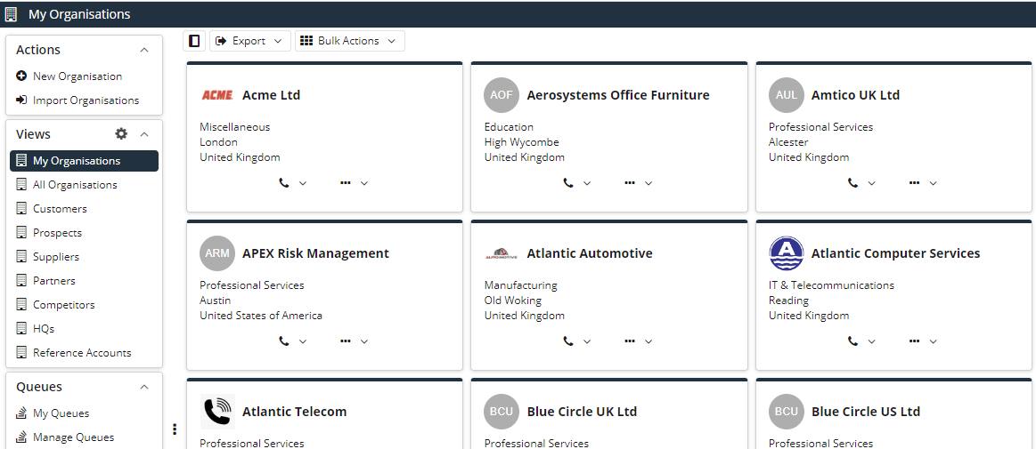
When first switching to Card View, for example on the My Organisations View, the view will show all Organisation records as cards. This is the basic view of records after switching, which can be customised further.
NOTE: Card View is available for the following Record Types: People, Organisations, Sales Leads, Opportunities, Activities and Custom Record Types.
Emails and Notes can be viewed in a similar format using the ‘View as _ List’ option, which is not customisable.
Customising Card View
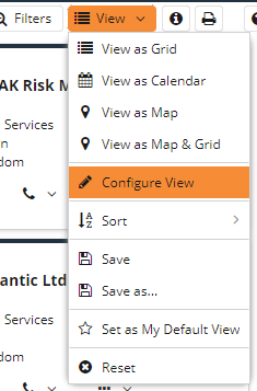
To be able to Configure and customise this view you will again need click View on the top right of the Landing Page, or Report, and you will now see an option for Configure View.
An easy to use, drag and drop window will appear, allowing you to Edit Card.
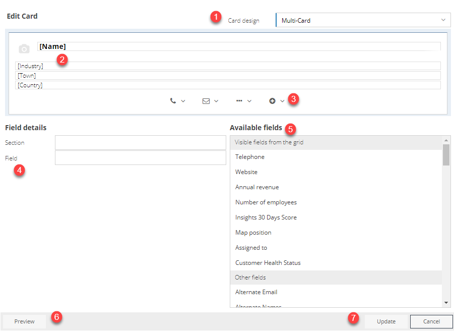
- Will give you options: Single Card, Single Card with image, Single Card with banner, Single Card with banner & image, Multi-Card, Multi-Card Card with banner & image (centred) and Multi-Card with banner & image (left).
- The standard fields shown before configuring. Fields from the Available fields, in section 4, can be dragged and dropped into this.
- Action buttons can be added from the fields available in section 5 using the plus button. If it’s a phone number field, it will populate the Phone action button. If it’s an email address field, it will populate the Email action button. Anything else will populate the next Ellipsis action button.
- Shows information on the field you have selected within section 2. This gives the option to show ‘Show Field Name’, which will then show the name of the field as well as what it is populated with, as well as the option to Remove the field.
- All the fields that can be added to section 2, via dragging and dropping, split by two categories ‘Visible from the grid’ () It is also worth mentioning, when choosing any Single Card option, 2 columns can be used to have information side by side.
- Will show a preview of what the card will look like in section 2.
- Will update/save your changes to the card view.
As mentioned above you can change the Card Design with a few options:
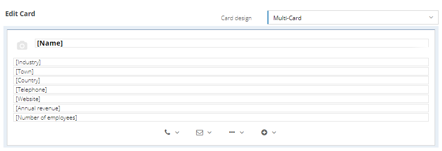
- Multi-Card – this option is the standard view given where you will be able to see multiple boxes on rows within the Landing Page.
- Single Card – will fill the Landing Page with one card per row. Selecting this will also give you the option to add fields into a second column, so you can have information next to each other. The standard icon used can also be changed. Clicking on the icon will give you one option per record type. This can also be done within the Single Card with Image option. A synopsis can be chosen, which can contain any field, but separated a little from the other information.
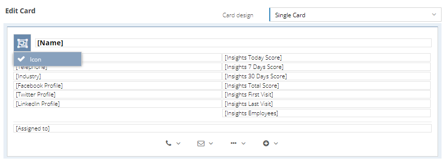
NOTE: If the Landing Page window is made small enough, the two columns will be merged into one column with a slight gap in between.
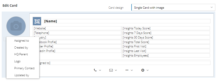
- Single Card with Image – the same as Single Card, but will show an image if populated within the record. When clicking on the picture, you will be given a choice of which image you want to show. This can be changed for example to the ‘Assigned to’ field, which will show the picture of the User who is assigned to this Person. It can also be changed to ‘Employer’, which will show the logo of the Organisation that the Person is employed by. If no image is chosen, it will show the faded camera logo like below.
NOTE: These views need to be saved and can also be shared like any other view.
As mentioned above, other options include Single Card with banner, Single Card with banner & image, Multi-Card with banner & image (centred) and Multi-Card with banner & image (left). Examples of a few of these can be found within the Report Card View Knowledge Base Page.